Your brand is more than just a logo: It could be the key to encourage your customers to take action!
In our highly competitive beverage industry, standing out is more critical than ever. From sparkling waters to craft beers and artisanal juices, consumers are presented with countless choices every time they walk into a store or browse an online marketplace. But what makes a customer pick your product over a competitor’s? The answer lies in one often overlooked factor: brand design.
As a brand designer, I work with businesses across the beverage industry to develop identities that don’t just look great—they also work on a psychological level to influence consumer choices. You may think you need one logo just to check the box of looking like a real business, but an in-depth brand design and strategic direction can improve every aspect of your customer-facing goods and services.
Visual Perception is the Main Influence on Consumer Behavior
Humans are visual creatures, and research consistently shows that visual perception can have a profound impact on behavior. According to studies, roughly 93% of human perception is visual, “with ten million sensory receptors dedicated to sight,” James Clear writes in his book Atomic Habits. Clear also talks about how arranging products in a store, specifically increasing their visibility, also has a profound impact on sales. If they say “out of sight, out of mind” then I’m sure the opposite is true: “In sight, on the mind”!
The power of suggestion is strong, and in this case, just seeing your product can be enough of a suggestion to make a sale! However, in a marketplace where consumers are bombarded with options, brand design is often the differentiating factor between someone choosing your drink or the one next to it.
This is particularly true for the beverage industry, where cans on a shelf in a grocery store don’t have the advantage of your brewery’s ambience or server’s friendliness. You need some special sauce to make your drinks fly off the shelves, because to shoppers, they are just liquid in aluminum, just like every other product out there.
So the designs on your cans (and the tone of voice you use on the labels) can level you up. The way your brand looks can instantly communicate your beverage’s flavor profile, target audience, and lifestyle appeal.
Colors Speak Louder Than Words
One of the most powerful components of brand design is color. According to color psychology, colors have an innate ability to evoke specific emotions and reactions. For example:
The right color palette can create an immediate connection with your target audience, sparking their desire to engage with your product. It’s no coincidence that Coca-Cola’s vibrant red and white combination has a sort of cool, retro vibe and Liquid Death connects with hardcore punk, biker, and goth styles.
- Red is often associated with excitement, passion, and energy. It’s why you’ll see it on sodas, energy drinks, and even some fruit juices. Red can stimulate appetite and create a sense of urgency, which is why it’s often used in the fast food and beverage industries.
- Green, on the other hand, is tied to health, freshness, and organic living. It’s the color of choice for brands focusing on wellness beverages, such as cold-pressed juices, smoothies, and eco-friendly bottled waters. Green helps convey purity and natural ingredients, building trust with health-conscious consumers. However, you don’t have to fit the basic mold. Think of Liquid Death!
- Blue evokes calmness, reliability, and trustworthiness. This is why it’s a dominant color in the water industries—plus it is the color of water…
However, you don’t have to fit the basic mold. Think of Liquid Death! They don’t have the basic, calm, clear blue direction, and they have water in cans, a move to a more recyclable resource that is plastic free. They definitely shook up the shelves and made water feel cool to drink!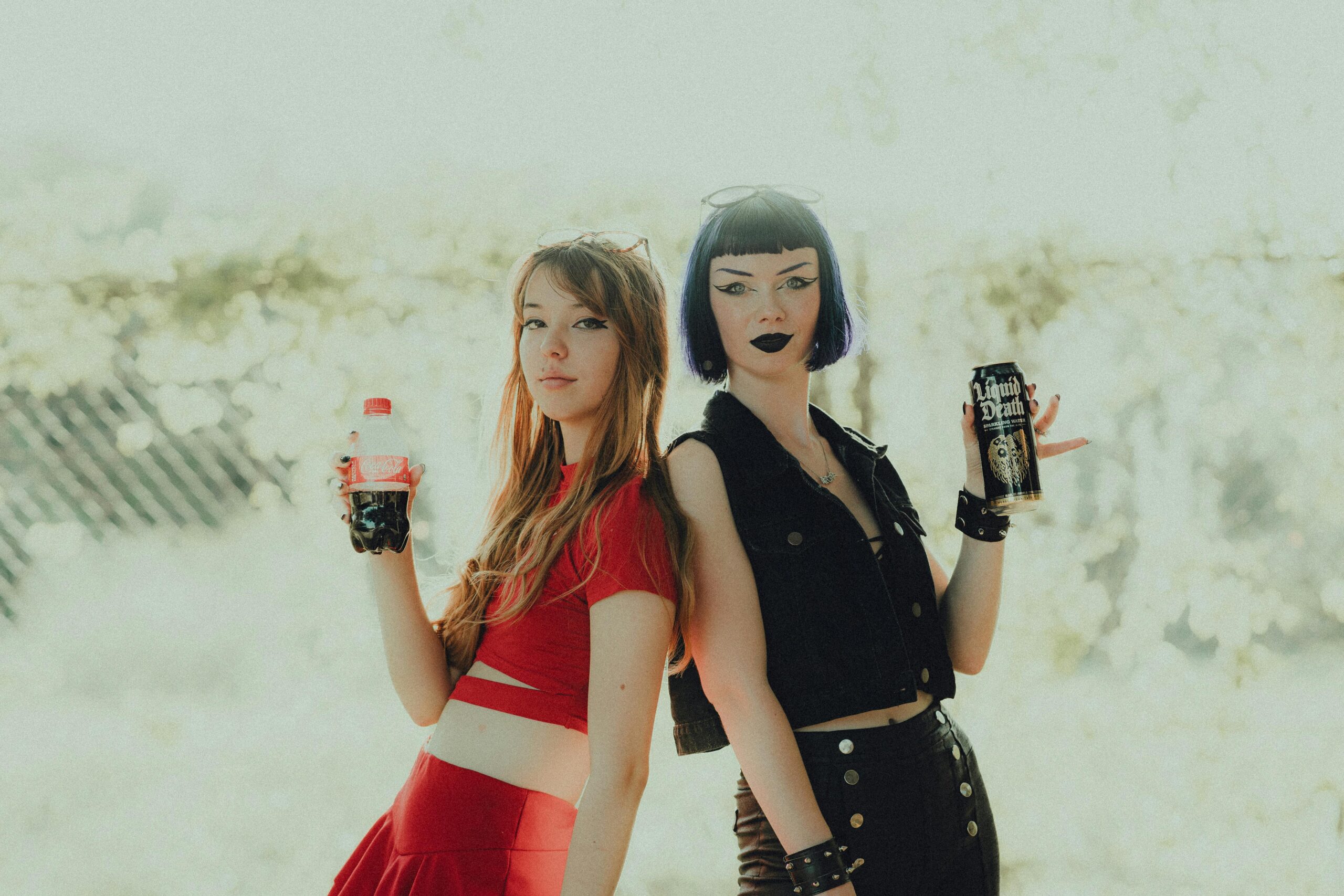
The Power of Typography, Logo Design, and Material
When it comes to typography and logos, simplicity and clarity are key. Consumers make decisions quickly, often in a split second. In that instant, they need to be able to understand what your brand stands for and whether it resonates with them. They also need to FEEL what you want them to feel.
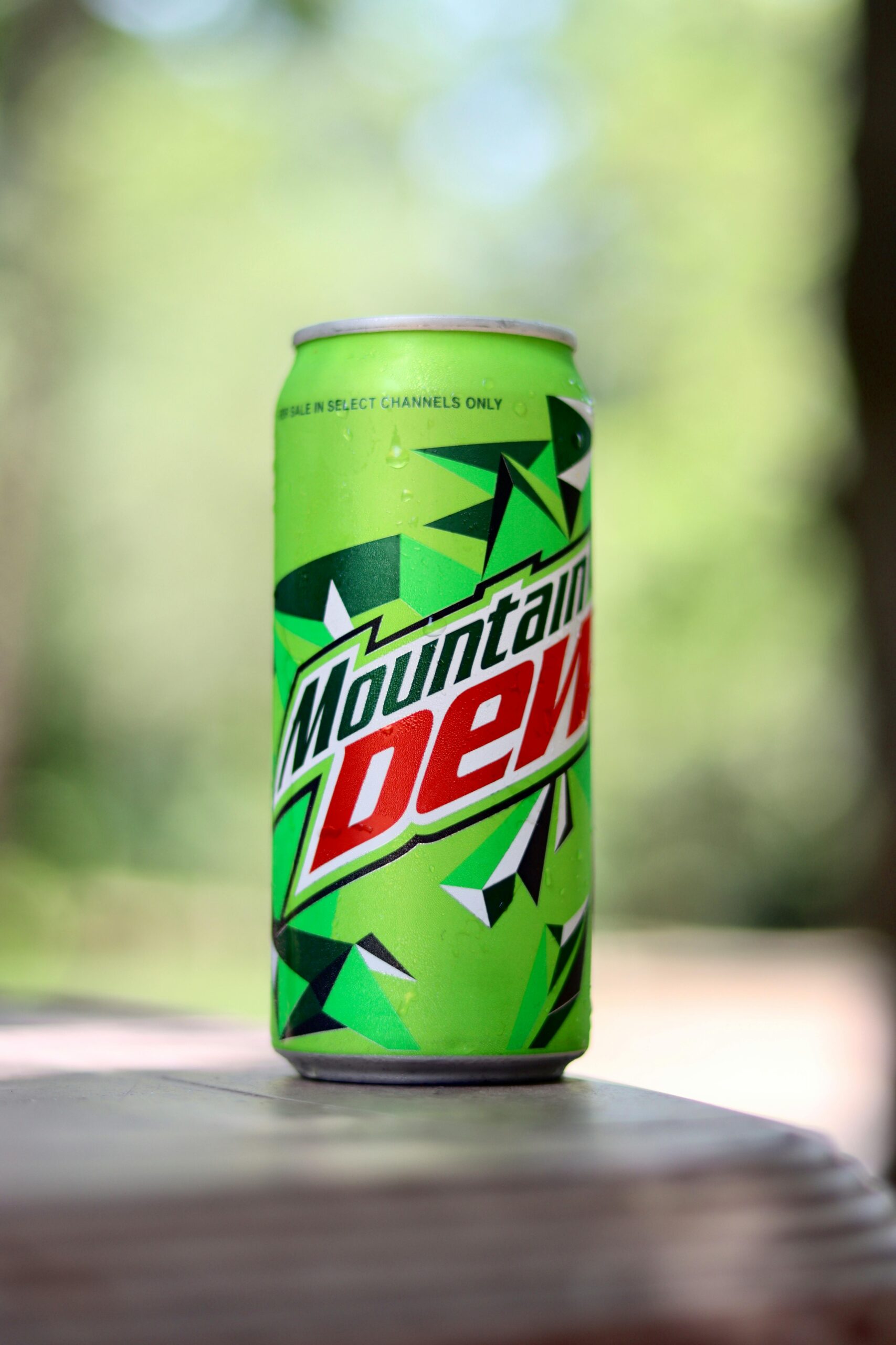
A well-designed logo may symbolize your values and mission, but if should also fit the vibe that attracts your target audience. For example, minimalist logo designs and glass bottles may attract a more lux crowd who cares about the environment, where bright and in-your-face brands like Mountain Dew attract teenagers who are okay with drinking a ton of sugar and wasting plastic.
Good typography also influences the perceived quality of your beverage. A clean, modern typeface tends to make the product feel more premium, while a more rustic or vintage style communicates tradition and authenticity. This is important for companies looking to create a specific emotional connection with their customers.
Not to mention, if you choose a typeface that is hard to read, people may get confused and skip over your product altogether.
Packaging Design Could be Your MVP
Studies show that 69% of consumers will make a purchase based on packaging design alone. Whether it’s a sleek, minimalistic design that conveys sophistication or a colorful, vibrant label that stands out on a crowded shelf, you should think about how the customer will interact with the packaging.
Is it glossy, smooth like butter, or rough like watercolor paper?
Will the label need to be waterproof so it can be put in a cooler or ice bucket?
Will you have a clever design on the adhesive side of the label or on the back/bottom? Under the cap?
Brand Consistency Builds Trust
As with any form of communication, consistency is essential. Whether it’s in your logo, colors, packaging, or messaging, it all helps build recognition and trust. Consumers are more likely to purchase from brands that catch their eye and that they recognize and feel familiar with. This is why it is essential to keep your brand’s design uniform across all touchpoints, from your website to your social media and in-store displays.
In conclusion, investing in thoughtful brand design isn’t just an aesthetic choice—it’s a strategic move that can lead to greater brand recognition, loyalty, and sales.
If you want your beverage business to thrive, it’s time to focus on how your brand looks and how it can drive consumer behavior! Send me a message if you’re ready to invest in your brand’s transformation!
Sell More Packaged Products with Brand Design
April 20, 2025